Draggable component
The right section displays the draggable component, which allows for drag-and-drop of elements. In our case, it will be charts. It provides better and simpler management of the space occupied.
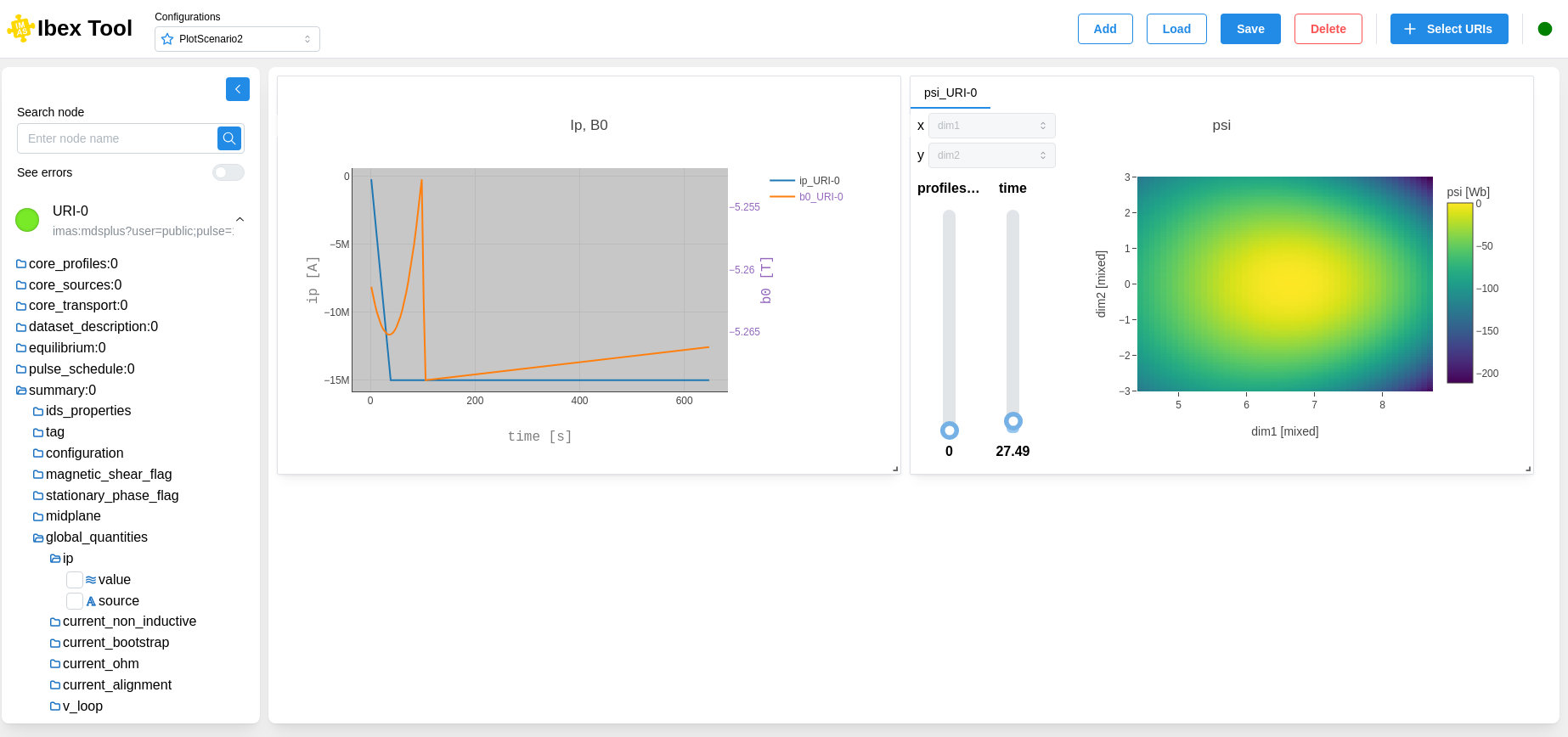
You can enlarge and move the chart as needed.
Each chart includes several options:
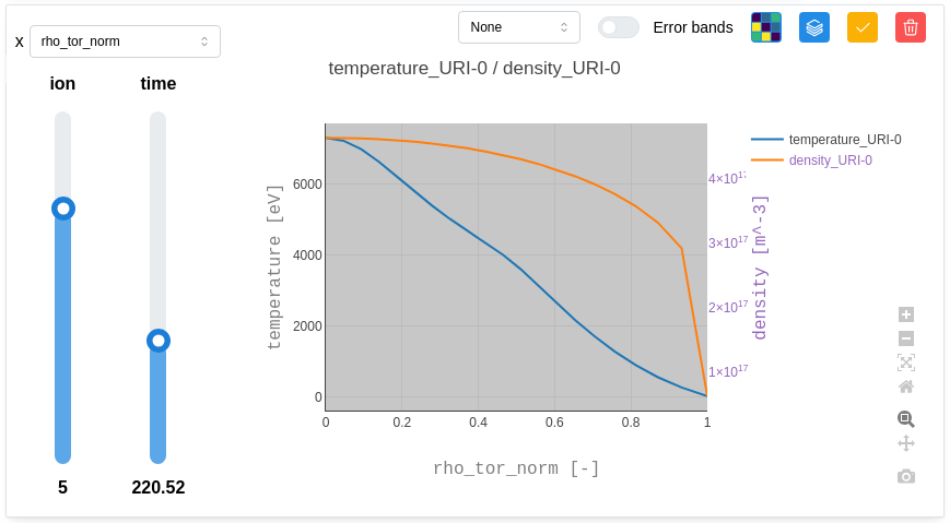
Downsampling method:
Selecting the downsampling method reduces the amount of data to be displayed while preserving the visual appearance of the data.
Error bands:
Enabling or disabling error bars allows you to load the “_error_upper” & “_error_lower” data to represent them as vertical lines.
1D / Heatmap view:
Allows you to select how you want the data to be displayed. In 1D, it will be represented as a plot, while in Heatmap, 2D data is displayed with a colour scale.
Inspect Metadata:
This opens a “Metadata” component that displays various information related to all nodes (path, min, max, average, value, coordinates, etc.). This gives the user a broader overview of the data.
Customize the grid:
It opens a “Customization” component which allows to personnalize the grid.
Edit Grid:
This option allows the user to edit the grid (add or remove nodes), if applicable to their use case. This also allows you to explore the data by moving the sliders.
Delete Grid:
This option allows the user to remove the grid from the draggable area.
Drag Plot / Stop Drag & Zoom In-Out:
This option helps the user focus on a specific chart. In “Drag” mode, the chart can be moved within the draggable area, and the grid size can be adjusted.
To zoom in or out, the grid must be in “Stop Drag” mode. Simply click the button again to toggle the state. In this mode, the user can zoom, pan, take a screenshot of the chart, and navigate within the chart and its axes.